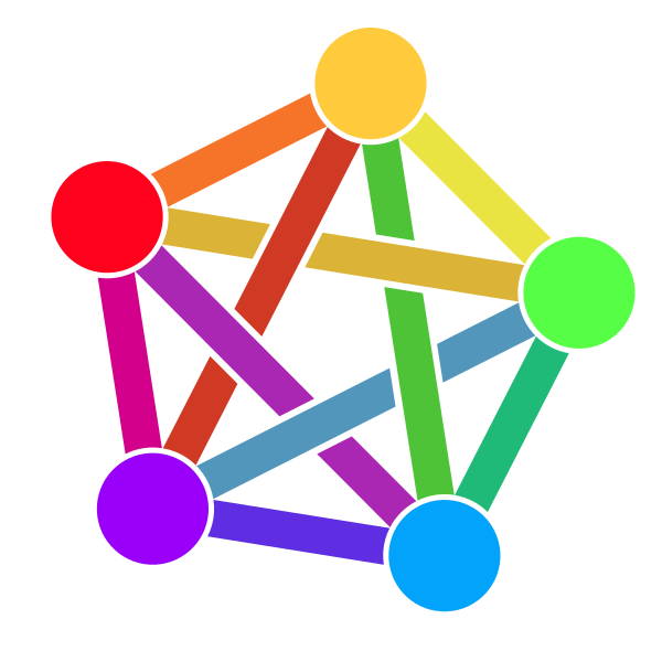
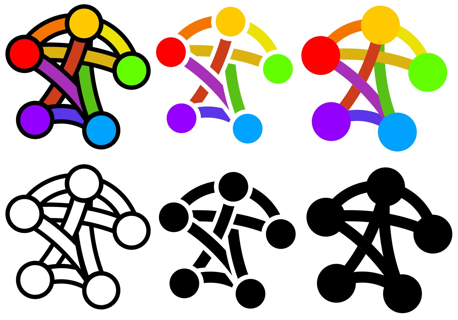
Some of you might already be aware of it, some might not: there exists a Fediverse logo/icon proposal, which was created with the idea of trying to convey in a single image the idea of Fediverse, which could be used in many contexts, including as a small icon. The fediverse is diverse, for sure, but it is something, and the idea is to express this somethingness with one image.
Do you think it is a good idea to try to create such logo/icon?
Do you like it and/or think this one is useful for its purpose?
Personally I like the idea of creating such logo (i am very visual). I think it can help to abstract the concept of Fediverse from the different types of nodes available (such as Mastodon, Diaspora, etc.), or even protocols.
IMHO Yes. It helps me to explain Federation. MastAdon has an “invasive branding” and in my experience people that doesn’t know about federated-tech tends to associate MastAdon as the Fedi itself…
Yes, I love this logo and I have used it a lot If anyone has more examples of adoption, please, feel free to share it in this etherpad “fedilogo”.
A little off topic, but does Diaspora connect to the rest of the fediverse?
Granted I’m pretty new to this, but in the research I’ve done it seems that not all of the Fediverse speaks ActivityPub, though I have yet to find a venn diagram of which software can talk to each other (OSocial, pump.io… are those still around? Then Diaspora…)
Hey,
totally On-Topic of this “Fediversity” category !
Yes, technically “The Fediverse” is the word to say “Different federated protocols”.
While things would be much easier if diaspora speaks ActivityPub and everybody has just a generic ActivityPub Server and diverse clients: diaspora is diaspora is diaspora.
pump.io was the predecessor of ActivityPub. The vocabulary is nearly the same and Evan, who did pump also has a Talk OStatus is basically still there because GNU Social uses it.
Neither mastodon nor pleroma support it anymore, so the user count drops but people can also use ActivityPub with GNU Social, see e.g. https://mastodon.social/@dansup/102076573310057902
So, yes, “Fediverse” refers to a mixture of ActivityPub and diaspora (and OStatus) …
I think, Friendica and Hubzilla can bridge it.
One thing that is missing is a combination of the Fediverse logo with the name “Fediverse” and maybe an additional tagline/slogan in both horizontal and centered alignment. Right now AFAIK we only have the logo icon. E.g. in this layout:
I like idea to have a slogan which can also be combined with the logo. It could also include a specific font (one with a correct license, of course!).
I have been thinking about that (I saw the post days ago), and I have come with an idea:
“Fediverse. Social network, social”
I’m not sure if it’s correct to say the Fediverse is a social network, or a federation of social networks. If so, maybe “Fediverse. Social networking, social” could do, but I don’t quite like it so much.
The idea of this motto is to imply that “the other social networks” aren’t really social, or maybe more correctly let’s say that being social is not their main point (it’s getting data from everyone to exploit it in many ways, advertising being just one).
I like “The people’s web” too: Because maybe the Fediverse goes beyond “just” social networking. And it is definitely the people’s, not the private companies’.
I’ll look for a good font or fonts for that too, let’s see what I can find!
Yes, you are right that there should be a relationship with ‘Social’ and a contrast with traditional social media. I also think it is very good to mention ‘People’, whereas the old media mention ‘users’. And then there is ‘fediverse’ and ‘federation’, which are a bit abstract. But what they do is to bring people together from all around their world, interconnecting many ‘micro’ social platforms… connecting --> uniting. People (re)united with Social. People united.
I like the more organic design, but I also like the vibrant brightness in colors of the current logo. Maybe those things can be combined. (The current logo, when displayed in monochrome color, looks a bit like an arcane symbol, rather than an organic social web that is emerging. The balanced nodes and straight lines also convey a ‘technical, very organized system’ idea.)
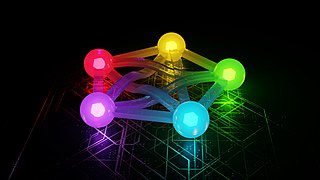
Edit: Tooted@pfefferle’s submission to fedi (note: interesting feedback in the toot), and commented:
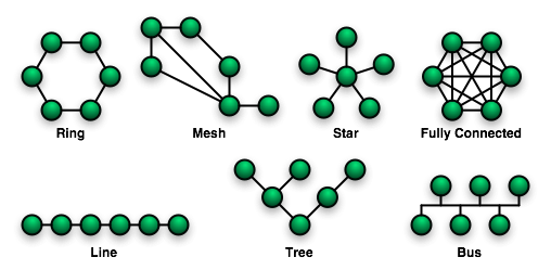
In terms of topologies the current logo stands for ‘fully connected’, while #fediverse is much more of a ‘mesh’.
Hi!
Thinking about these things you’ve all said, I’ve come up with something I hope conveys some of them. It has 3 variations for color, and 3 for mono:
Like I said on Fedi, I adore the design. From the variations the leftmost ones appeal most to me. Some observations:
The pentagram node position was mentioned a number of times as to-be-avoided (though it doesn’t bother me much). There was suggestion for a ‘constellation’, maybe in an “F” shape (seems hard to do right).
I sometimes preceive a person shape in it, which sometimes appears cool, but sometimes feels as a bit ‘clumsy’ figure (hunched shoulders, idk?). It’s weird, I know A rotation or flip may help to avoid it, maybe.
I just noticed that the color scheme looks way batter on a dark background rather than a light one, where the colors look too dull to me (like the yellow connector between green and red node). Maybe yet more splashy, in-your-face vibrant colors will help fix that.
Edit: Nah, looking further at it. The pentagram complaint should really be no issue in this design anymore. Sufficiently mitigated.
What about, instead of a mesh network, using a patchwork? After all, the idea of pre-existing individual nodes connected by stable links sounds a bit less dynamic and accurate than accumulated patches with fuzzy borders and random overlap.
Exactly what I wanted to write (but it’s not weird).
To be true, I very much like this perception because fedi is about humans and friends, not about machines.
But yes, if it would be flipped or raises hand, it would be a bit more emancipatory.
About the colors:
We can have a look later and do one version for light and one for dark backgrounds (“perceived lightness”) so that for the receiver, the colors are persistent.
Hm but for an “icon”?
Nobody will rerecognize after awaking
I understand the organic idea but this is quite hard for Logos.
See the unilever logo for example.
They try washing at a psychedelic scale but it is recognizable as an “U” as well.
Needs any shape …
“The People’s Web” would match “The Year of the Fediverse”.
But it would be big in China
Like
“People. Social. United.”
Think very political, then for me it is more
“Social. People. Solidarity.”
because United sounds more like labour for me while Solidarity is a political attitude.
btw:
“The opinion that art should have nothing to do with politics is itself a political attitude.” as in Public Domain


 the design. From the variations the leftmost ones appeal most to me. Some observations:

 as in Public Domain