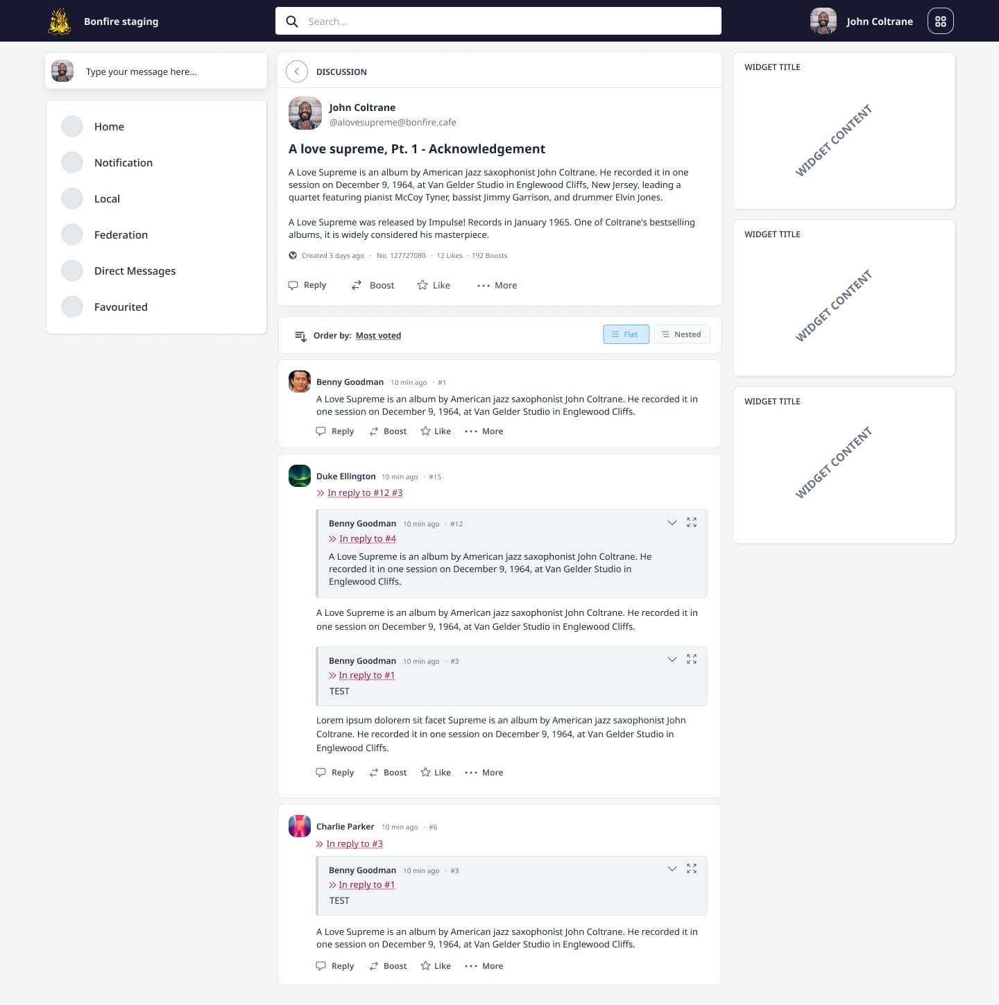
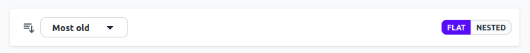
Discussing Bonfire thread UX

:white_check_mark: Added the new logged template
:white_check_mark: Use some chronological increasing index numbers instead of the keys. (a la github issue)
:white_check_mark: Have a mention at the top of “In reply to comment #1, #12 and #15” or something.
:white_check_mark: Show the inline reply blocks expanded by default for readability and expand inline to see the whole post ( default shows ony the quoted part)
:white_check_mark:Tagged posts do not show the avatar neither the actions, users need to jump to the original comment post to interact with the default activity preview.
:white_check_mark: Add a sorting tab and a switcher between flat and tree layout

Features to discuss

  • As a user I want to highlight a portion of text to cite it in my reply (it should create a quote out of a tagged post)
  • As a user I want to tag a post by referencing it with a simple chronological number (#1, #2, #3, …)
  • As a user I want to sort thread replies (most liked | most cited | oldest | newest )
1 Like

the last few days I developed an html mockup of the thread UX/UI as discussed. It is live here https://blissful-yalow-e9e022.netlify.app/src/index.html , remember that this page shows only the central column, the thread content, without the rest of the template, and it is not possible to add comment to thread, just visualize and expand subthreads or move between comments clicking on some links.
What do you think?

  • The icon on the left of ‘Most old’ looks like it is interactive, but if it is not it is confusing.
    • May put icon inside dropdown dialog, different one per choice.
    • Or may align dropdown to the right, so icon stands on its own.
    • May also change icon to be more indicative of conveying ‘thread settings’ if not interactive.
    • Icon may have a hoover title “Specify your discussion preferences to the right” or something.
  • I’d change the label text to ‘Oldest first’, ‘Newest first’ or something similar.
  • ‘Most voted’ is confusing. You ‘Like’ replies, so it should be ‘Most liked’ then?
    • In any case I’d reserve the word ‘Vote’ for something that is actually a Vote.
    • Maybe ‘Upvote’ (and possibly ‘Downvote’) might be used if you wanna avoid 'Like’s,
  • “Flat / Nested” may also be “List view / Tree view”.

Some other remarks:

  • I don’t know if it is confusing to only show interaction metrics (no. of boosts etc.) after first interaction occurred.
  • I’d use single/plural i.e. “1 Reply / 2 Replies”. (It is just a mockup, I know, just telling).
  • Really like Participants and Links metric on top post. Clicking them expands a list?
  • Hovering over an action might show a border around it, rather than just a color change, for accessibility (colorblind).
  • If you click ‘… More’ does a dropdown menu follow, or does the toolbar expand to the right?
2 Likes

An additional feature that may be a cool-to-have are Discussion Mentions. If someone drops a discussion link in another discussion then an entry can be created in the referenced thread (similar to Github issue mentions creating cross-references automatically). Btw, the ‘mention’ is a type of action / interaction and there could be many more of those in different types.

2 Likes

Yeah we definitively want to have cross-threads mentions

2 Likes

Thanks for the feedbacks, I really appreciated those!

I’ve improved the menu and the mobile version a bit
https://blissful-yalow-e9e022.netlify.app/src/index.html

I think it’s fine, given the actions are anyway already visible under the post content, having displaied them in both places without an effective reason imo is a repetition.

Yes you should be already able to expand the list

I think it’s fine that it changes the cursor to a pointer type when hovering the button, that’s the default accessibility pattern to let the user understand it’s a button

It should appear a dropdown, will add next

1 Like

Have you implemented that?