Discussing Bonfire thread UX

Below a series of screenshots that represent the team brainstorming and state-of-the-art of how we plan to manage a discussion in bonfire from a UX point of view.
IMO this can be a great occasion to co-design and create a feedback circle, to build a shared UX that overcomes most of current challenges and frustrations when dealing with threads.
Those mockups are built with Figma, they are available to view (and comment if you’ve a figma account) here,
or you can also fork them here and use them for your own purposes.
ps. I’ve intentionally avoided to design the whole page, but I focused those initial effort on the thread section (640px width on tablet and desktop)
Mobile mockups will follow.

1 Thread without nested replies

2 Thread with 1 nested replies level

3 Thread with 4 nested replies level

We assume the admins decided to set 4 replies as max. Therefore when reached the 4 nested level the user is not allowed to create a direct reply, but has to fork the reply in a new thread to reply to it. nd. The fork button is available at any nested level under the more button

4 Thread with 4 nested replies level / closed

Clicking on the gray line the user can hide all the nested replies below that level to simplify the reading experience

5 Thread with 4 nested replies level / closed 2

6 Thread with nested replies

When a reply gets more than 3 replies, next ones are automatically collapsed and hide from the initial view and can be show with a special button

7 Reply to a reply

2 Likes

I frequently get into the following situation on fedi:

  • A thread forks because people reply on all different posts in it with different mentions.
  • All the forks become separate discussions entirely, and they veer off-topic, and you must manage them in parallel.
  • People receive replies out-of-context in their timeline and respond without reading other responses.
  • So they mention stuff already discussed, and there’s no good ways to point the to the branch where that happened.
  • Meanwhile the flattened discussion from the top becomes messier and messier.

Recently I was into this monster discussion hierarchy triggered by me, and I counted that I was into 30+ parallel discussion at the same time. Via @Chartodon bot, made by @ColinWright I was able to visualize it, and Colin made a handy thumbnail overview of it:

On microblogging fedi (Mastodon, etc.) these huge discussions aren’t rare edge cases. UX in these threads is terrible on Mastodon. But also on e.g. Loomio and Hacker News the UX is not great. Biggest issue imho is:

  • Seeing clearly visualised where in the thread (can be all throughout the hierarchy) new entries are created.
  • Ability to navigate the hierarchy and jump to these locations, moving back and forth through the tree.

Note that Discourse (this forum software) has a nice UX pattern too, where new entries are always on the buttom in a flat list design, but where you have “In response to …” indicators in top right of your reply, and the ability to either expand that post inline, or jump to it. And you can easily quote text, which then also contains a link to the post where you were quoting from.

1 Like

I’ll zoom out a bit to introduce a new section in the thread page that can help the discussion: widgets
Bonfire social is designed with a 2-columns layout.
The 2-columns layout has a better balance between good navigability and exposed features vs amount of information and actions submitted to the user.
I’ve added a new mockup, representing a full thread page: the right section imo is where we can imagine custom widgets that users can enable or switch to help navigate the thread accorging to their own preferences and habits (both in term of maps, summarized info, quick actions, etc)

1 Like

DiscDAG is an experimental conversation base that lets one reply to more than one comment, and hence you can pull different parallel sub-threads together. People are careless, people are time-poor, people will respond to what they see at the time, so the branching will always happen. You need someone to curate the discussion, to pull threads together, and to tie together comments that are saying essentially the same thing.

DiscDAG lets you do that, but I have no front end skills, so while the capabilities of the system are (in my experience) vastly superior, no one will use it because it’s hard to use, ugly, and clunky.

2 Likes

hello Colin, do you think DiscDAG can work as an optional plugin that appears in the right section as the picture above? In any case would you mind to share some relevant link to know more about it?

Here’s a link to an example “discussion”:

https://www.solipsys.co.uk/cgi-bin/DiscDAG.py?DiscussionID=UsingTheDiscussionSystem

In truth, that’s documentation produced using the system, rather than an actual of a discussion, but it demonstrates several of the features. Here’s a png of the same chart:

I don’t think it would fit well with the plugin idea, but it might. I don’t know enough, and I certainly couldn’t code it. I don’t think it would play nicely with the existing system, but perhaps it could … I just don’t know.

Once you’ve read the linked chart, perhaps you could explain your thinking about how they might be integrated.

Part of the problem I see is that no existing forum allows for the tying together of divergent threads. That’s one of the things DiscDAG does, but it’s hard to see how to scarf that into an existing system.

2 Likes

I’d like to keep zooming out a bit more, and put more possibilities on the table to consider together.

Social networks are all about discussions, but often discussions goals are somehow driven by the social network agenda in a more or less conscious way.
Mainstream social networks infact, dictates the discussion UX and UI mostly to increase/force users engagement and more in general to reach their business targets - it does not have to be this way for community-driven social networks.

In my experience, most of the time a group talks about what is the best way to handle discussions over a platform, it ends up mostly about pushing each one personal preferences, that usually span between Flat vs Nested/Three design plus some meaningful enhancements.

Such preferences though are usually backed up by personal habits and how each of us like to read contents and engage in online conversations.

Things get particularly complicated with social network, because meanwhile forums and chats have a more or less consistent bias toward how a discussion should flow and be experienced, social networks have more implicit blurred bounds.

So, given it’s not that easy to pick one UX that satisfies the various range of topics and flows that can arise in social network discussions, why don’t we do the opposite, and imagine how user motivations can drive the discussion UX?

That’s not a totally new approach, facebook for example let the user decide the post layout depending on the activity type (but afaik not the discussion thread). Reddit instead let the users customize the replies order.
My idea is to do both.
Based upon the user motivation, the whole thread and the actions the audience is allowed to perform should change accordingly.

This implies 2 level of flexibility: The author can decide the default layout and which actions are available, the post audience can sort / reorganize the replies according to their own preferences.

Following an (incomplete) list of motivations to start a discussion on a social network:

  • Ask a question
  • Express an opinion
  • Express a feeling
  • Share a link
  • Open a debate
  • Share information
  • Collect information
  • Check the sentiment
  • Make a joke

And here, a list of parameters that usually shape the most common discussion pages UX/UI

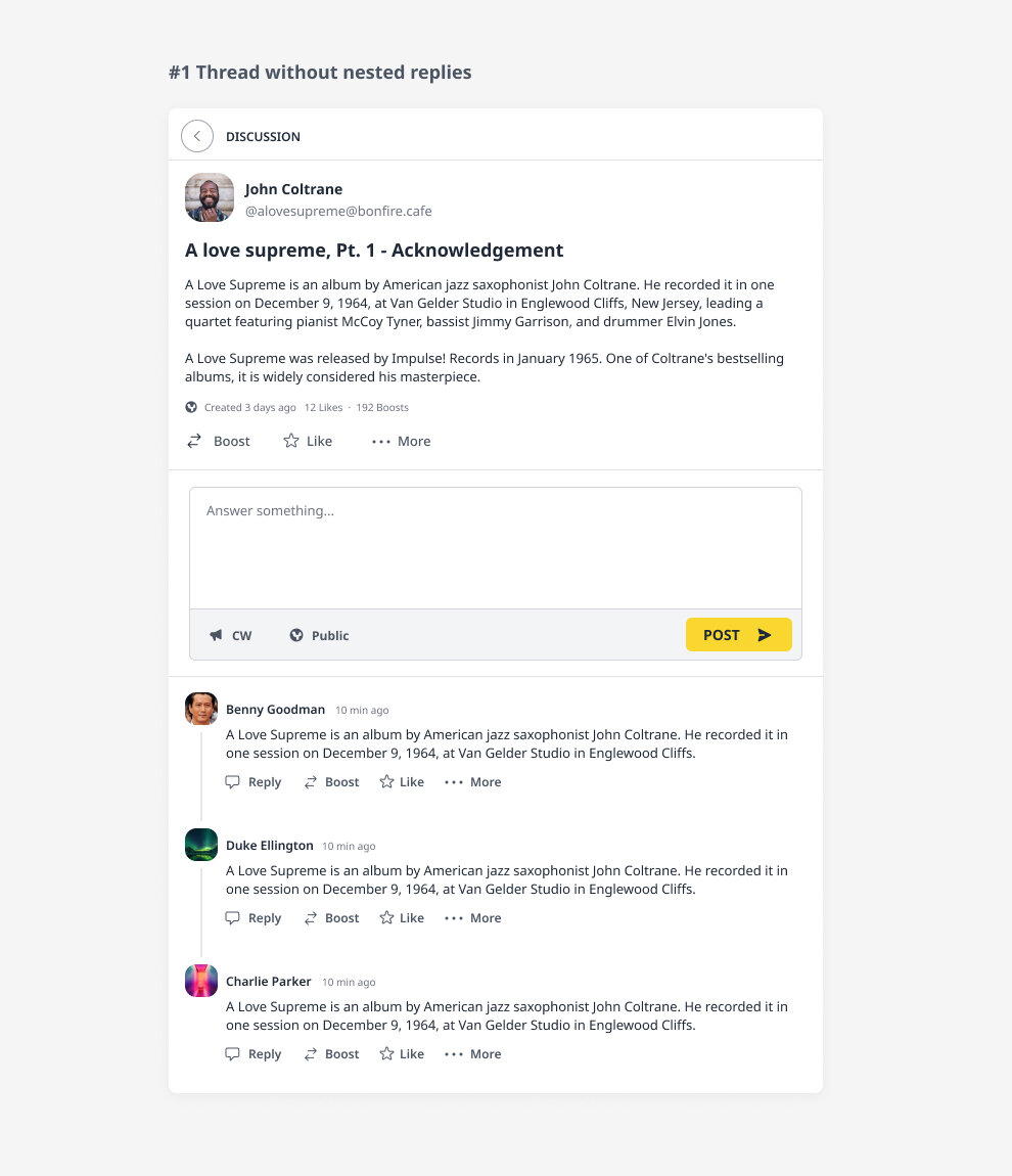
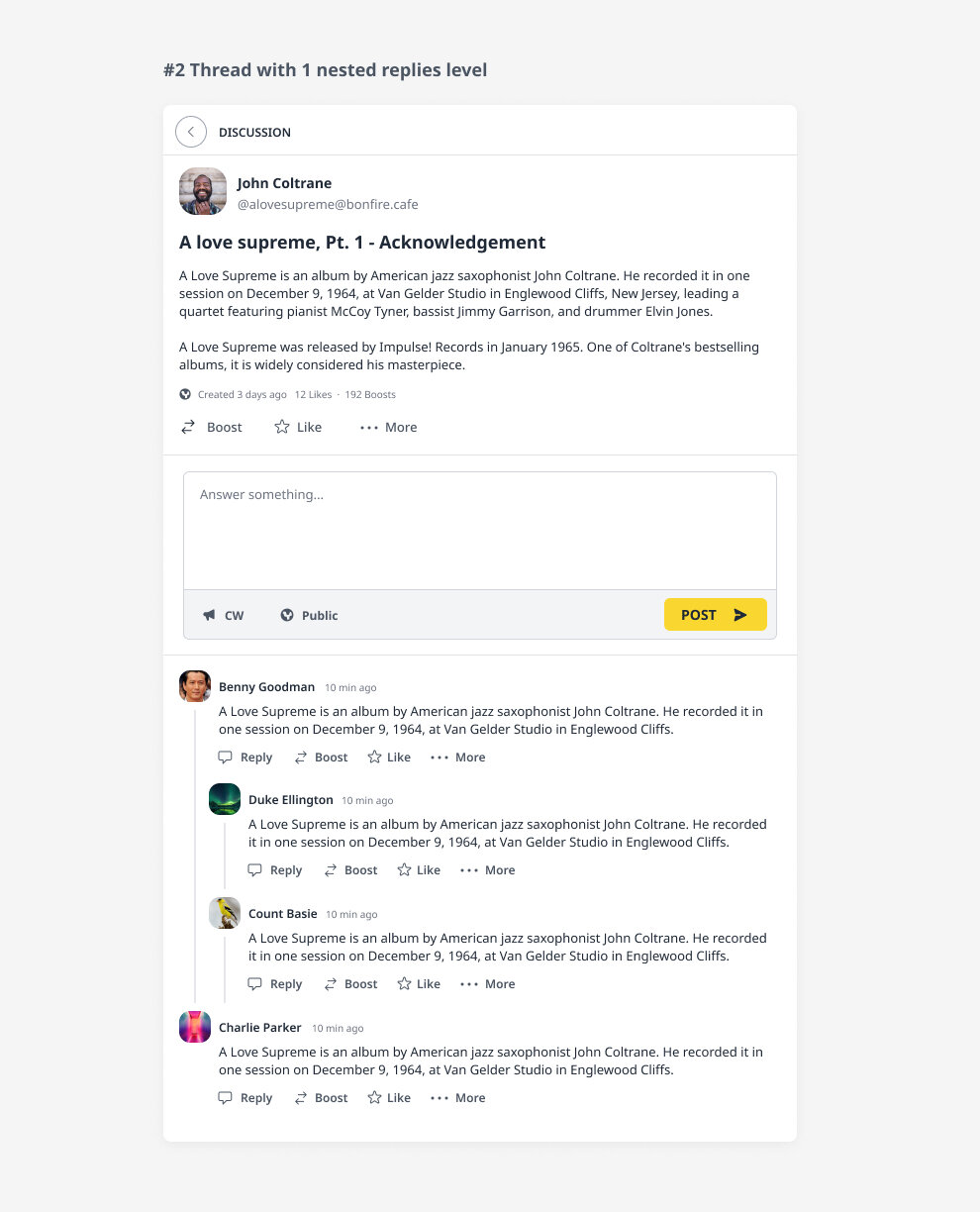
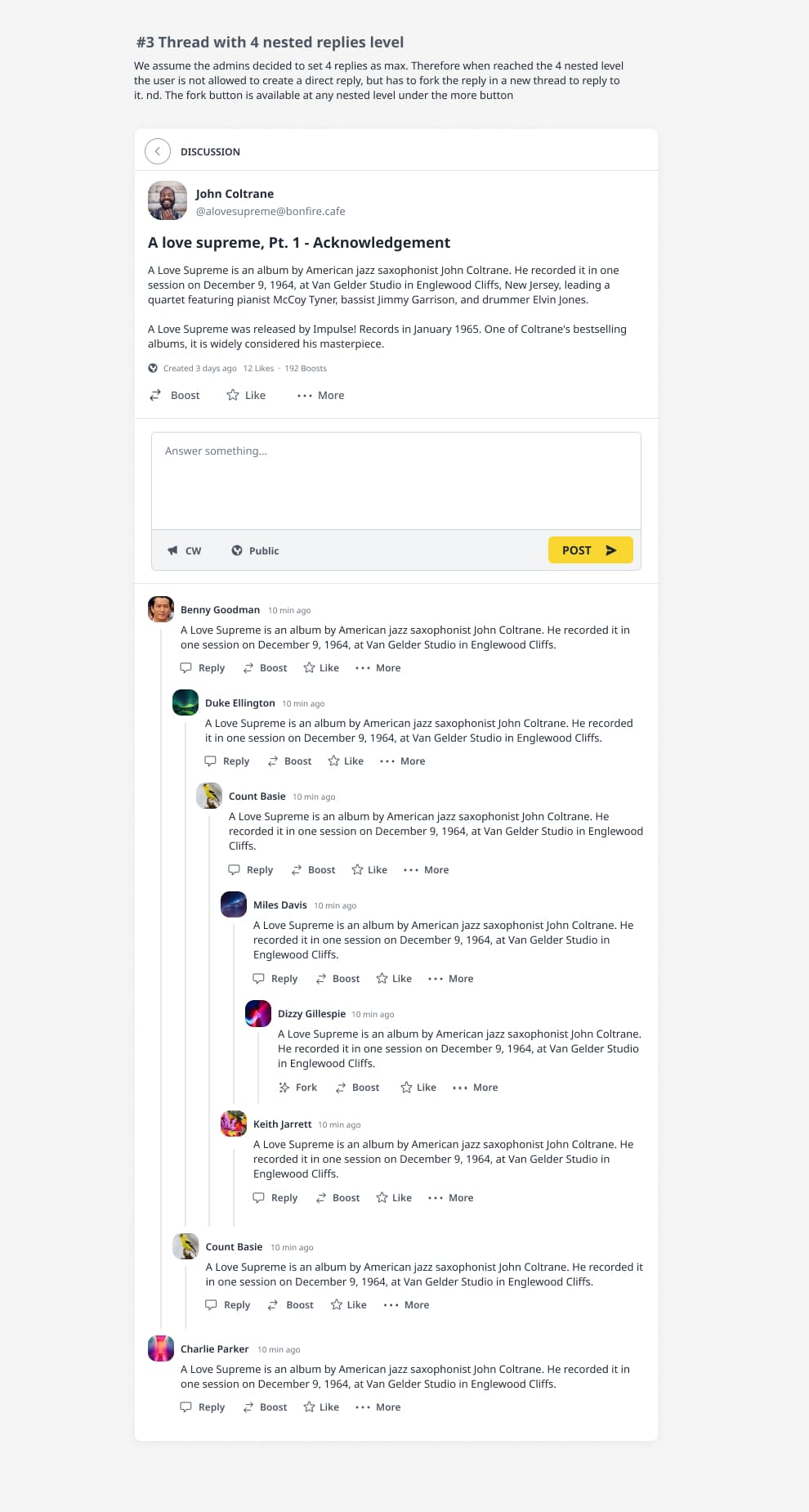
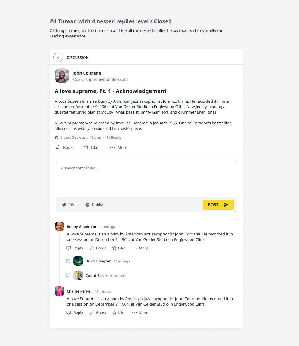
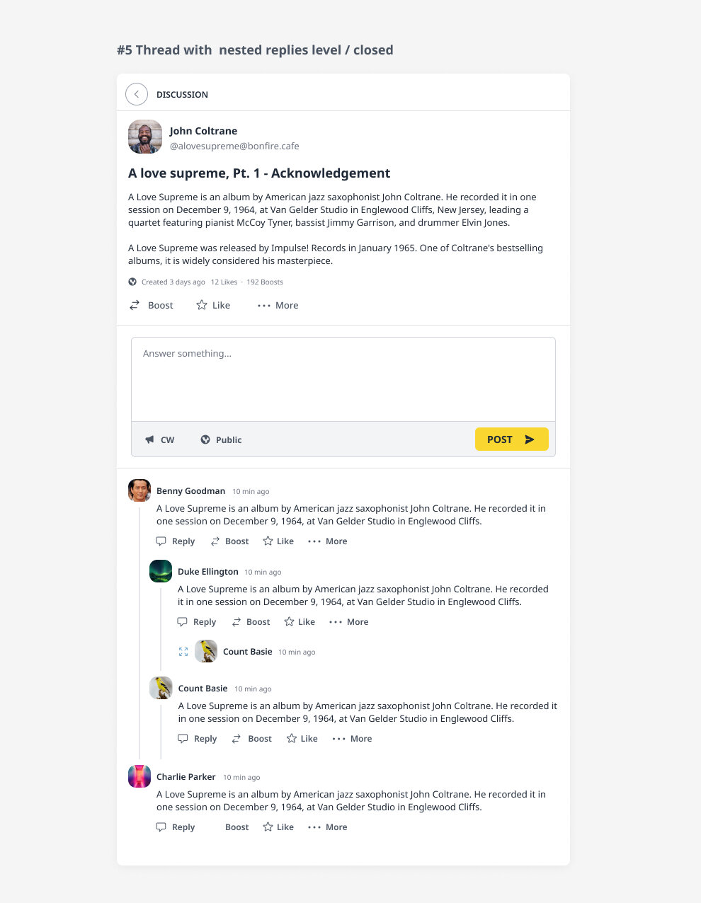
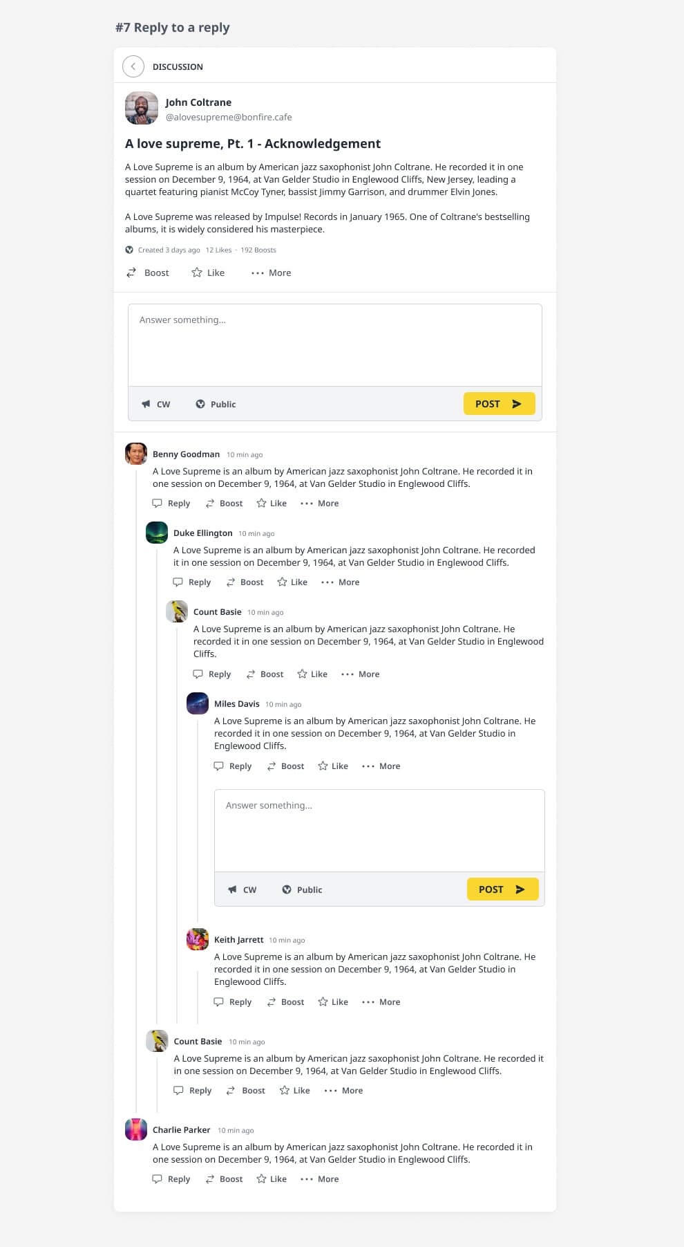
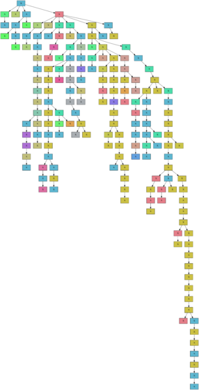
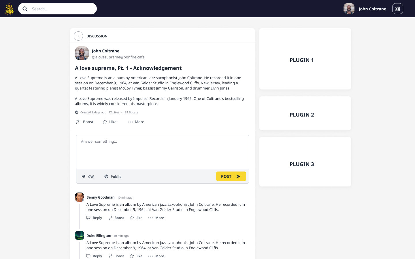
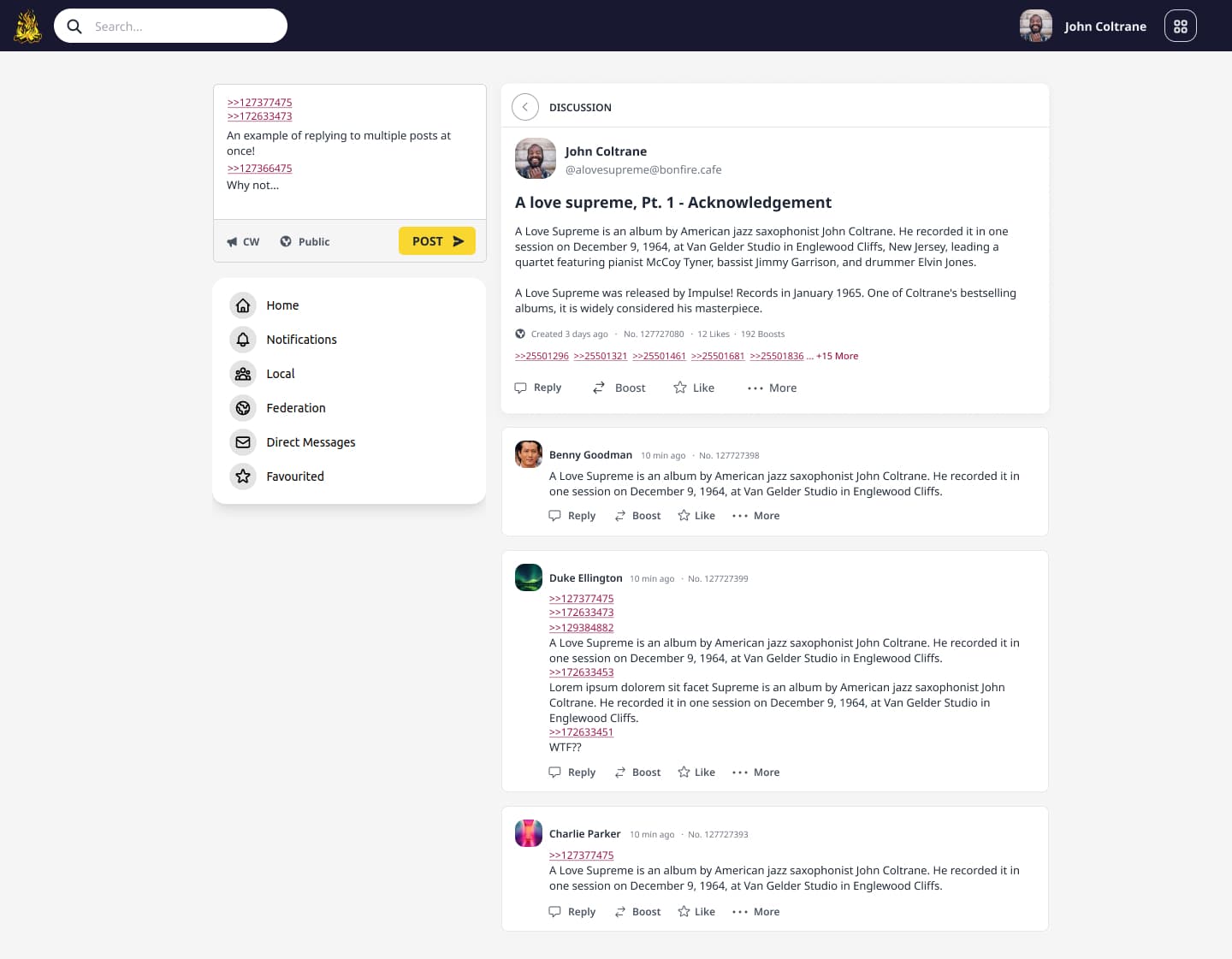
  • Replies sorting: New | Old | Most voted | Most replies
  • Layout: Flat | Three | Q&A
  • Vote a reply: YES | NO
  • Pick an answer: YES | NO
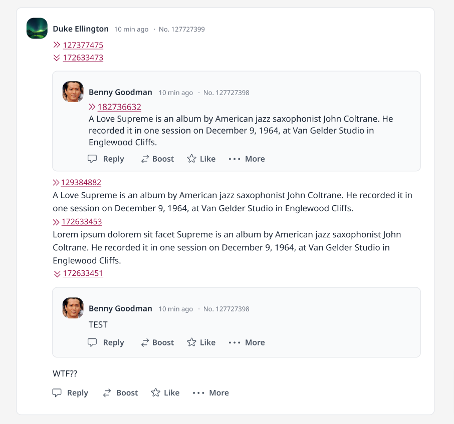
  • Replies: Inline | Flat with a reference to the replied activity | Both
  • Nested level: No (Flat) | 1 level | Customisable
  • Reply to one or more posts (by tagging each post number) | Reply to someone ( by “@someone” )

Questions time:

  • Based on how those parameters are combined together, can we create one or more UX/UI that fulfill each motivation?
  • Would it be too confusing for users to interact with different discussions that have (slightly or not ) different UX/UI on the same platform?
  • How many variations we would end up with?
  • Is it somehow meaningful for others apart from me or I am just mumbling XD :slight_smile:
2 Likes

We allow the threading depth to be a site decision, and provide a flat display of the conversation. Thread level is indicated by a number of little arrows above each post (>>>>>) for those more used to expanding conversations into trees. These arrows alternate their shading so you can subconsciously count them easier. Our default flow is one level, but this allow visualisations of fully threaded conversations without them all hammering the right border after the the 20th or 30th level or descending an endless staircase. The only federation concern is that likes/dislikes on comments are discarded above the site’s thread limit. These aren’t folded into the parent conversation total because they may be liking/disliking something entirely different. Anyway people have strong opinions about threading UI and will debate this until the world’s final days. We try and provide a balance in the UI that is inclusive to different needs and requirements and doesn’t look horrible due to potentially endless indentation.

2 Likes

Hello @macgirvin , thanks to contribute to the discussion… when you say “we” to which platform you’re referring to? So that I can test the UX/UI you’re describing .

Zap, Osada, Redmatrix, Mistpark, Roadhouse, and Streams.

1 Like

Hello,

I want to point out that this forum/reddit style of thread is not the only one.
There is a hugely popular alternative (and in my opinion superior) way to have long and branching discussion: Imageboard like threads.
(DiscDAG seems to be something similar)

In imageboard threads you can reply to a post just by writing the post number, you can write it everywhere in your reply. This is very convenient because it allows you to structure your post however you want. You can also reply to how many posts you want this way (thus forming a Directed acyclic graph of replies).

Those kind of threads are shown in a linear way in chronological order.
But post numbers in replies are clickable and allow you to jump to the cited post. Each post also show the list of posts replying to them.
This makes navigating the thread very easy and enjoyable.
With this system it is easy, normal, and enjoyable to have a thread with 300+ posts and lots of diverging subjects.

Notice that reply are made to a post (by tagging the post number), this is unlike in mastodon where we reply to someone (by “@someone”).
This focus the discussion on the content and not on the peoples. This is also why imageboards are mostly anonymous.

By the way we already have federated imageboards: https://fchan.xyz/

2 Likes

Thanks a lot @swrup - I totally forgot imageboard thread UX (as i was never an active member of any of them).

This:

and this:

are extremely relevant, as a way to improve/enrich a thread data structure with meaningful metadata that are user generated. This way we could have space for experimenting with different visualisation for different threads types.

I’ll update the above comment to include also this

1 Like

I did a mockup of an imageboard-like thread UX adapted to the bonfire UI, and I like it pretty much, because it addresses some issues I had since some time.

Here a draft:

( In this mockup, I imagined a user in the process of replying to few comments, quoting them on the create activity form in the upper-left sidebar )

Things I like at a first glance:

  • Consistency with the other pages layout (sidebar + main content)
  • The user has just 1 place to publish / reply to a discussion (the create activity form on the left sidebar), instead of showing multiple forms under each reply, this is quite great for accessibility.
  • The user can reply to multiple comments at once (mind-blowing XD )
  • Flat layout is easier to deal with, but at the same time users can navigate complexity and dig into nested threads (I think it can work well mixed with how @aschrijver was pointing out, about how discourse manages to show inline / nested replies in a flat UX

Here a draft of an expanded comment:

@swrup I’d appreciate your feedback, if I’m missing something relevant or getting something wrong :slight_smile:

Question:

  • Do we introduce compatibility issues with the rest of federated platforms if we mention posts rather than users in our threads ? ( This should not be a blocker imo, but something to ponder )
1 Like

Very nice!!

I don’t know about compatibility issues.
It may not looks very good to have random numbers in a post when reading from other federated app lol

ActivityPub objects should have unique global identifiers, maybe the post number used to reply can be that identifier (but I guess it is absurdly long and not very human readable …).
With this idea maybe we could reply not just to a “post” but to any ActivityPub object :thinking:

I think the challenge is making the use of links in the post easy, readable and not scary.
A lot of user are put off by imageboard because they don’t immediately understand how replies works.

For example when clicking the “reply” button, it should automatically insert the post number in the reply, and when writing your reply clicking on other post should insert the post number for you. This way you never have to actually write it.

If the discussion is contained to a single thread and you don’t want to be able to link to another thread, you won’t need to have long numbers for post ids and could just reset the post id to 1 for every thread.
Maybe adding colors or letters to the links can help too.

Also something I like a lot when reading on imageboards is to have a popup with a view of the post when hovering my mouse over a link, so you don’t even have to click on the link if you just want to read it.
Expanding comment like in your example looks good too!

We can reduce the number length on the UI, like how is commonly done for pubkeys: something like: 138...381?
I’d like to summon @mayel here among many others, and hear his feedbacks about this

+1 this is how I was imagining it (and how 4chan works basically)

I tend to prefer showing the replied comment once the user click on the number (expanding it) rather than through mouse hovering.
Tooltips on hover are made for coincise and short information, showing a complex box full of information on hover is quite a bad accessibility pattern imo: It breaks the default flow of information that the user experiences on the thread page, and it may ends up scaring different types of users on different levels or just disrupt the attention flow.

1 Like

Oh so you’re discussing the storage of comment trees. Let me introduce my cursed system for putting one into a relational database, MySQL in my case. Each comment has a reply_key. This is a varbinary field. It stores the sequence of ids of all parent comments and the post, starting with the post (they all share the same table), as 32-bit integers. You can select a comment subtree at an arbitrary depth by searching by prefix via LIKE BINARY. You can trivially go to any level up the thread as well given only the comment id.

The limitation of this system is that each comment can only have one parent. You may want some kind of intermediary table if you need one-to-many relationships.

1 Like

@grishka We use a similar approach at the moment (often called a materialised path), but with an array column as postgres allows, see implementation here: GitHub - bonfire-networks/ecto_materialized_path: Tree structure & hierarchy for ecto models

Currently discussing whether we want multiple reply_tos in which case we’d need to change the data structure. Another option would be having one reply_to but multiple mentions of posts…

Pasting here a summary of today team discussion about it (also on github)

  • activitypub essentially imposes a single reply_to for a message
  • in bonfire social, we also have this at present
  • it seems interesting to permit multiple reply_to. email supported it, but no widely used email software did.
  • in a threaded tree view where you could reply to multiple posts, it would become natural to render posts in multiple places, which some people might find confusing.
  • there can be many mentions of a post within a post in AP (tags) and in bonfire (edges - tbd which edges)
  • perhaps reply_to is just something we have to do for AP purposes and we should use mentions to draw the thread graph?
  • this might be a bit startling moving from one fedi software to another if it is too different
  • mastodon uses flat threads. to some degree, there isn’t much we can do about it at least there.
  • sometimes we want to keep track of a particular branch of a discussion (tree threads good for this), sometimes we want to track the whole thread to catch up, or to see how it evolves (flat threads with chronological ordering good for this).
  • trees do not really show off the full richness of a directed graph.
  • we should prefill mentions so the user can edit them when replying

So after lots of brainstorming based on the awesome feedback and ideas in this thread, in today’s Bonfire team meeting, we agreed to:

  • keep reply_to as a single field (in order to better interoperate with existing ActivityPub apps, and to optionally display a tree UI without repeated replies),
  • to also add a one-to-many way to mention other posts so we can have either tree views, image-board style views, or various hybrid approaches

Our decisions are just an agreement about something that’s “good enough to try for now” so the discussion can continue!.. :slight_smile:

1 Like

Some possible improvements to the UX concept…

  • Use some chronological increasing index numbers instead of the keys.
  • Have a mention at the top of “In reply to comment #1, #12 and #15” or something.
  • Show the inline reply blocks expanded by default for readability
  • Probably only quoting part of the text and then truncate with ‘…’
  • Possibly have ability to expand inline as Discourse has too.
  • Maybe have a ‘collapse all’ icon on a comment post.

If you want to remove the focus on who posted what, and have the content itself be central, then you shouldn’t show the avatar and maybe also not the Like, Boost chrome. If you wanna boost then first jump to the original comment post. Or only show this when inline expanding the quoted post. (Maybe this can be a preference setting, either per account or instance-wide).

2 Likes