I like the more organic design, but I also like the vibrant brightness in colors of the current logo. Maybe those things can be combined. (The current logo, when displayed in monochrome color, looks a bit like an arcane symbol, rather than an organic social web that is emerging. The balanced nodes and straight lines also convey a ‘technical, very organized system’ idea.)
Edit: Tooted @pfefferle’s submission to fedi (note: interesting feedback in the toot), and commented:
In terms of topologies the current logo stands for ‘fully connected’, while #fediverse is much more of a ‘mesh’.
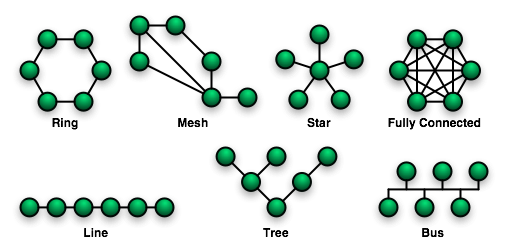
(source: Wikimedia)