Since a lot of people seem concerned about jurisdictions under which social media instances operate, you can try adapting your social media decentralization-tracking methodology to plot how spread the Fediverse instances and ATmosphere components are, across geographies and jurisdictions.
You could do it as a country-wise spread, and maybe you can also do it as a global north versus global south (Africa, Asia, Latin America) spread.
It is well-known that almost all of the instances and infrastructure is located in the USA and in Europe, but it would be good to track how this evolves.
It is also obvious from all the trending users/topics that the active Fediverse and ATmosphere user bases are overwhelmingly from the global north. But I don’t know if you can adapt your methodology to plot this, and to track it over time. May be worth trying.
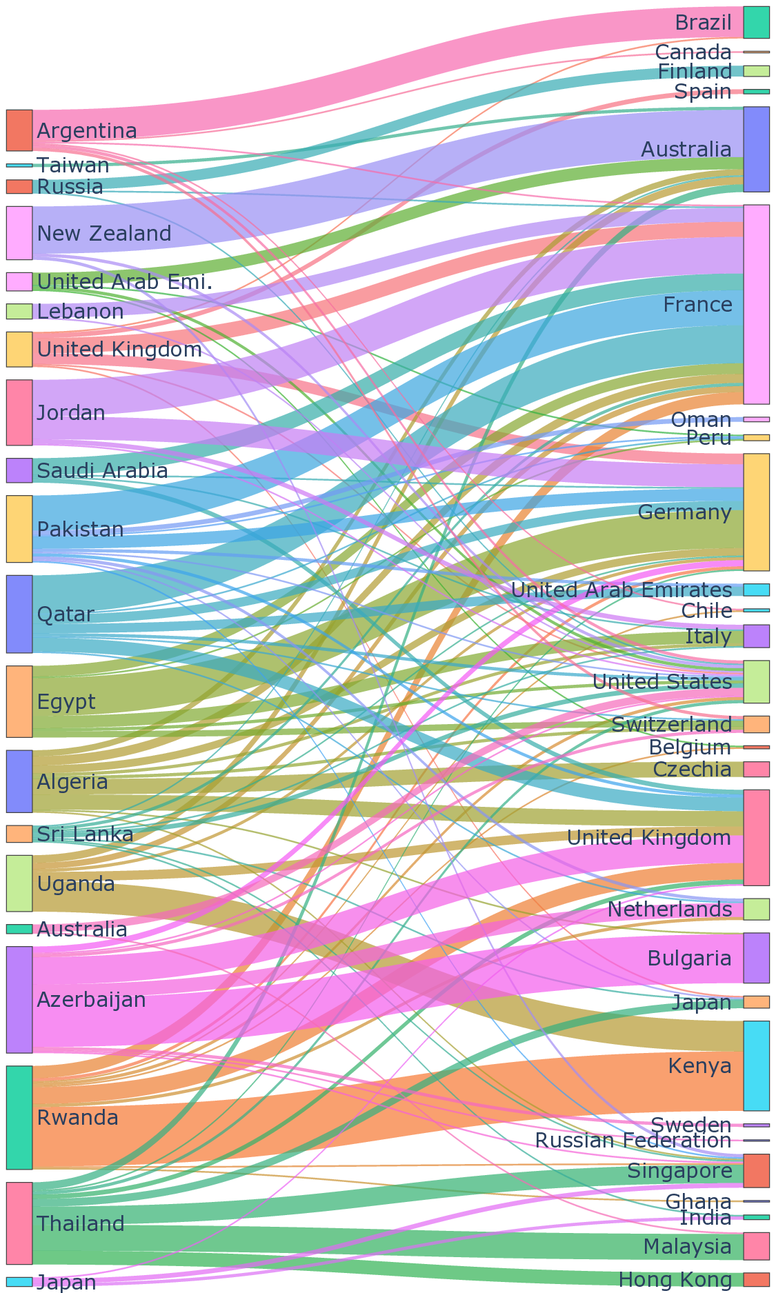
@feralthoughts I'm very interested in studying Internet infrastructure in the global south. I have a paper with @sachindhke appearing next month about studying web tracking infrastructure in places outside the US and Europe (those are already well studied). We're working on the final revision to it right now, and I'll post a thread about it here when we're done.
Here's a teaser. In this figure, the countries on the left are the ones we tested *from* - eg. ran web browsers on volunteers' machines in these countries and fetched a bunch of sites. The countries on the right are where the web trackers those websites embedded are hosted. The size of the lines connecting them show the number of trackers.