Interesting. I implemented VK’s variant of “masonry layout” (ab)using CSS grid a while ago. It’s generated fully on the backend, the layout keeps its aspect ratio when resized and requires zero JS. Here’s one and another post as an example. (I just now realized that I don’t have any posts with many photos on my live instance, but the algorithm supports up to 10)
This is nice.
In general I know that we can do without JS, this is why I support the mentioned native CSS which we can already use today in FF behind a flag.
I would do it with a similar CSS fallback than yours but then not all of the following would be met …
There are some constraint for redaktor and one is the
grid-auto-rows: var(--line, 16px); in my CSS
which is adjusting the thing to redaktors’ solid baseline, everything multicolumn will regardless of font sizes have the same typographic baseline everywhere.
If people look at widgets-preview/_typo.css at d593028bebfe5948c814cc95a1d90652c91e3040 · redaktor/widgets-preview · GitHub they would probably think I am crazy with these strange numbers  but the reason is that when you build a theme in redaktor CMS, you can define a rythm (like when playing guitar) and base size for your typography.
And so anything containing media must snap …
The other thing is that the layout is fully responsive 240px - 4K and so the number of “columns” in the masonry will vary …
However, Firefox has it and Safari in the Technology Preview so I think, browser support should be ready soon …
btw: There is also a post on images: Opinions on `images`?
What would interest me looking at your markup:
How can we define picture srcset from ActivityPub input?
I guess this could be a task for AS3 because at least density is not supported while width/height is …
What I meant with <picture> / srcset is:
Would that be a srcset ?
Spec. Example 51 but with width …
{
  "@context": "https://www.w3.org/ns/activitystreams",
  "type": "Image",
  "name": "Cat Jumping on Wagon",
  "url": [
    {
      "type": "Link",
      "href": "http://example.org/image.jpeg",
      "mediaType": "image/jpeg",
      "width": 400
    },
    {
      "type": "Link",
      "href": "http://example.org/image.png",
      "mediaType": "image/jpeg",
      "width": 1920
    }
  ]
}Right now I simply put links to full-size jpegs into my ActivityPub objects because that’s what everyone understands. Internally I store images as a single webp file (for space savings) and generate other formats and sizes on-the-fly using imgproxy and store them in a fixed-size nginx cache — so an image going from one Smithereen instance to another would be recompressed many times along the way: webp → jpg → webp (and then again → jpg if you’re on safari).
Yes, it would indeed be nice to serve webp to those who can deal with it. It would also be nice to serve multiple image sizes for the receiving side to choose from — this would be especially beneficial to those implementing c2s.
1 Like
@grishka
Hello,
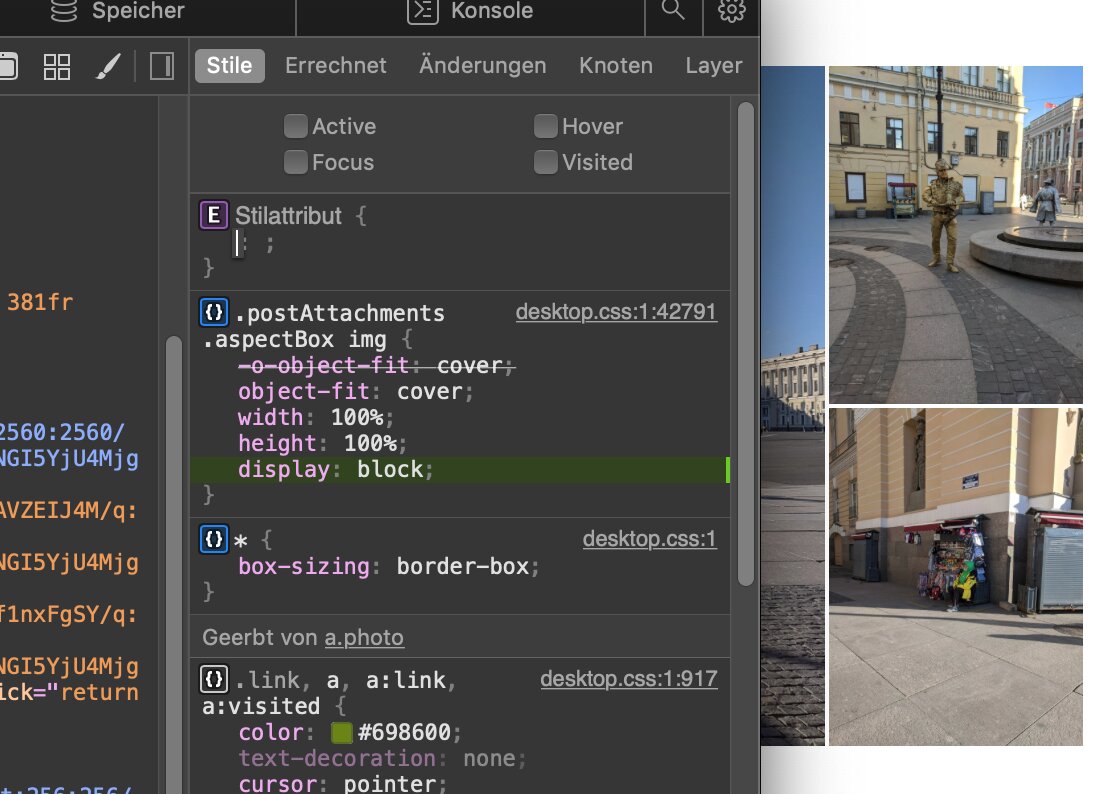
I found a small bug  in the masonry you posted which is, the gaps are different horizontally and vertically.
This is cause <img> is inline by default but should be block …
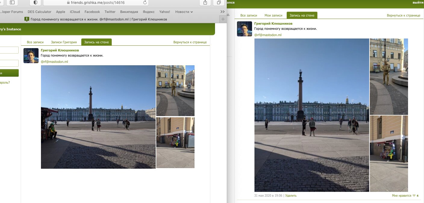
See e.g. Город понемногу возвращается к жизни. @rf@mastodon.ml | Григорий Клюшников

1 Like
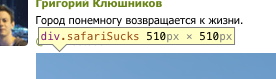
Ugh. Those stray paddings for text descenders ruin everything again. Also interesting that it only happens in Safari. And actually, this isn’t the only thing Safari renders wrong (look at the height):
Thanks for pointing this out
Yes. Safari is currently very “funny” and makes my life “interesting”, also ¯\_(ツ)_/¯:
1 Like
Okay, so Safari for some bizarre reason still wants to determine the size of those divs by deriving it from the intrinsic size of their contents, even though I did everything I could think of to prevent this exact thing from happening. Simple test: add display: none to those <img>'s and see the surrounding divs magically disappear. FWIW it does exactly what I want in Chrome and Firefox.
Sigh. Safari is really the IE of the modern ages.
Fixed it by wrapping an additional div around the grid. Apparently it didn’t like how the height of the parent was 0 because of the padding-in-percent trick.
Just in case, you need more photos 
Feel free to use any of my archive stuff. I am currently thinking anyway about a model to release any material where the syndication by the customer ended >5 years ago as Creative Commons (and how to automate this) …
For example, some reportage from the archives is on (sorry) diaspora
Climate Refugees
Tsunami
Gun City
but there are also “positive” ones
By balloon across the alps
A farm for kids