A figure raising a hand would be a very cool abstract form of the constellation of nodes!
But before we get to that, there’s a fierce discussion on the Fedi toot, about whether or not to just stick with what we already have (see root of thread). Ended inconclusive with a proposal in this toot by @eudaimon:
Maybe a good first step would be to launch a poll about the original logo, try to spread it as much as possible in the Fediverse to get the maximum number of opinions. If it looks people accept it, then there is probably no need to change it, even if we can think of “objectively better” options.
This is how I see the issue, at least…
What options could such a poll include? Is a Mastodon poll correctly handled in other softwares?
Note that, if we decide to stick with the current logo, the new design by @eudaimon (which I find personally more appealing) may be still be used, but for a particular fedi application (I am thinking for a fedi platform that can be used for many purposes, like e.g. @cjsGo-Fed, which I believe is still looking for one) if Eudaimon consents to that.
Slogan
More slogans have been suggested in the toot thread..
Fediverse: The future of social
Fediverse: Dare to decentralize
Fediverse: The Rebel’s Spirit
Fediverse: Back to basics
Fediverse: For clever people
Fediverse: Connecting nerds
Fediverse: For Inventers and Idealists
Fediverse: pa-para-papam. I’m fixin’ it
Fediverse: Providing choices
Thanks @how. There’s no ‘good’ way in this regard. This thread was started by @eudaimon based on current logo still referenced as a proposal, and they want to do a poll. It may lead to a new variant being favoured, or not. May leads to multiple variations becoming used (where a marketing type in a company would shout “No, no, NO”, but for organic fedi it may be alright), or we might not further pursue alternatives and the current alternative candidates could be reused elsewhere.
Another candidate from the toot thread, by @dsfgs. The double lines form the ‘F’ shape of Fediverse:
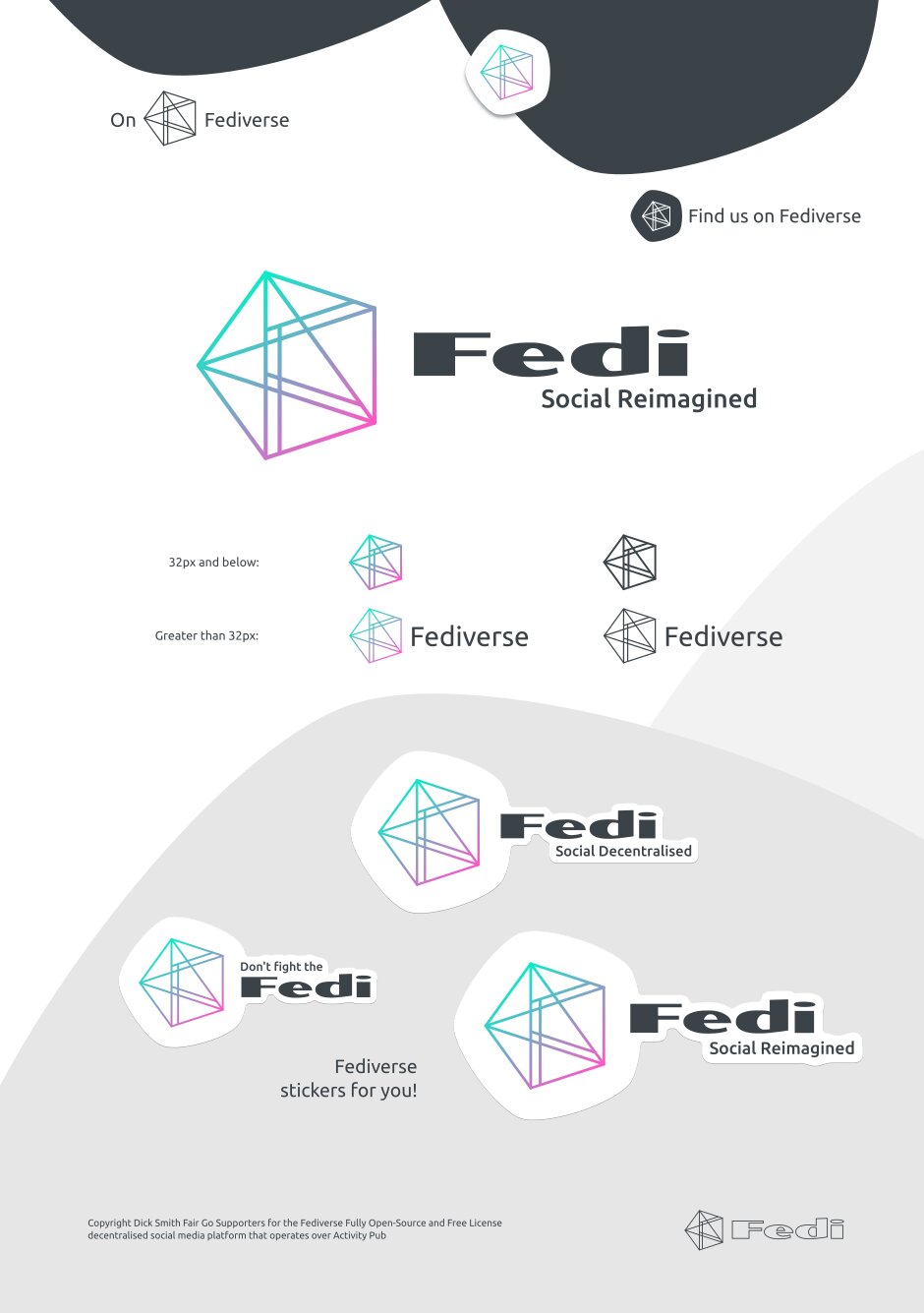
I very much like the idea to have variations for certain contexts.
So much thanks to @eudaimon @dsfgs
Totally disagree with this
Design by committee will lead you… Nowhere.
Yes yes, it might not lead to a new official logo and we might stick to the original one.
BUT it leads already to a supercool debate about what people think about the fediverse, what they want.
It is so much more valuable to “people thinking in pictures” than the debates of Aristotle people.
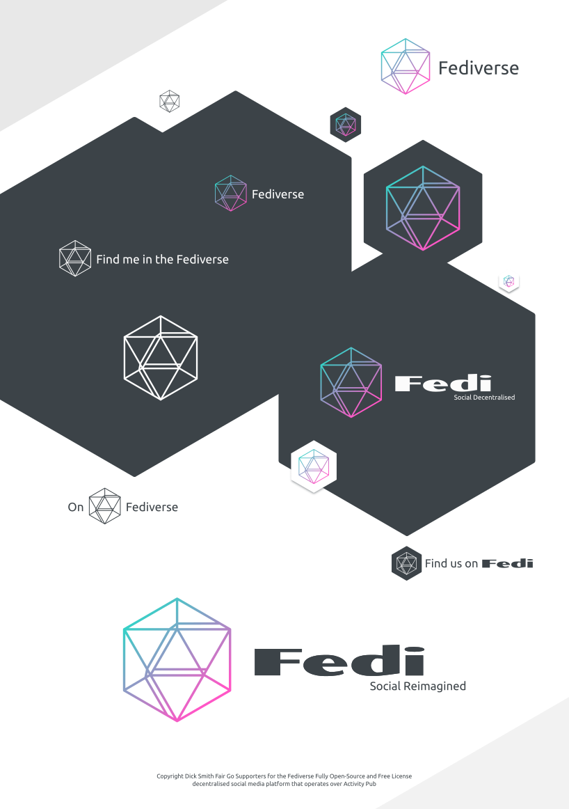
My 2 cents about Dick Smiths Fair Go Supporters’ logo:
It is superprofessional design and especially I like the hexagon/comb idea.
If you look at https://conf.activitypub.rocks/ there are also combs for a reason.
I wanted to indicate that
• we work together like bees
• Fedi is sweet like honey
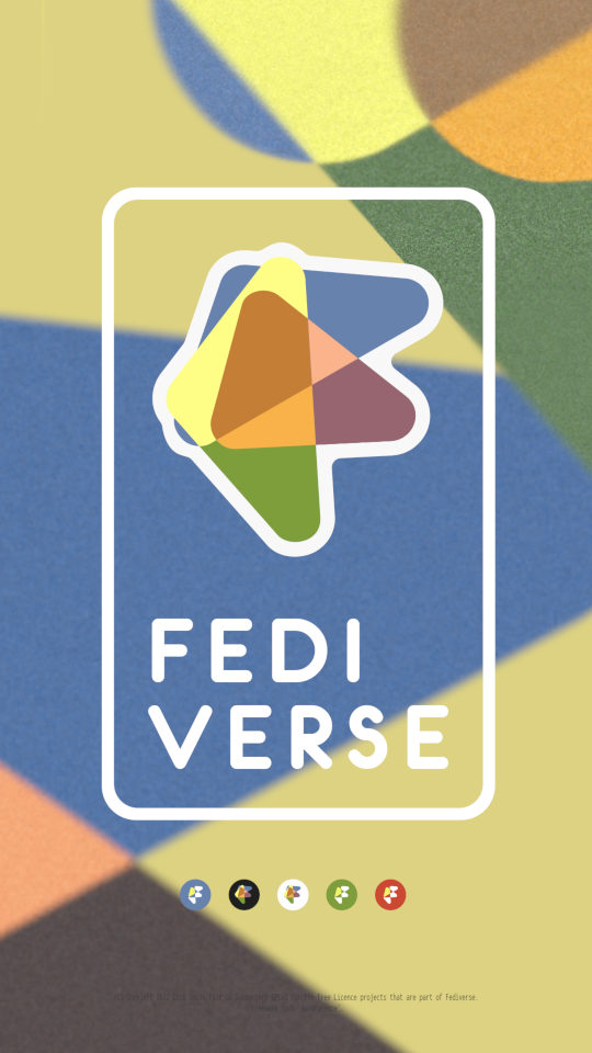
I thought I’d have a go at something without the connected-network motif (just for variety and because it feels like a lot of elements going on in a logo). This is what I came up with:
Probably someone who has studied design (or learnt its principles) could point some errors (or “things that don’t work towards its purpose”) of the current proposal, and probably these two new proposals address them, so maybe it could be argued that these are better proposals than the current one.
Personally I decide to trust the results of the poll (even if it is of course not a reliable method to gather the actual fediverse’s feeling about it, and its sample size is tiny).
Anyway, anyone is free to use any logo they want! That’s the beauty of the Fediverse (or the disadvantage depending on how you look at it).
Maybe the Wikipedia page for the Fediverse could serve as a “universal” (because it’s very visited) and hopefully neutral place to present all the alternatives?
Thank you all, and I’m sure this will continue in the future. I’ll be glad to participate in one or other way
Just to bring more confusion to the topic – Hail Eris!, it sounds good to me to have a variety of logos to indicate diversity. Of course, this makes it all more confusing because you cannot really figure out what you’re talking about… Or can you?
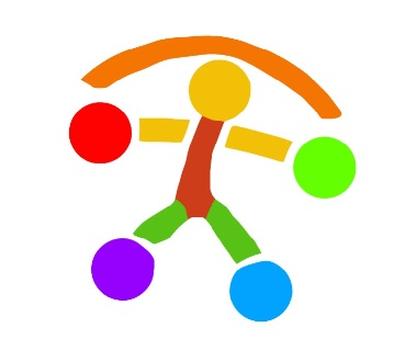
I like it, though the curve at the top should be more representative of a safe home, than an burden on the shoulder (even though that is factually accurate given the world’s poor state). Or as a spring cord, to indicate playfulness and joy, which the diverse colors already convey. We must go to an era of joyful creation as a species, supported by a human and harmious social web, a veritable peopleverse.
Funny seeing this old thread get some new activity. I don’t think I posted anything about this here so might as well do that now. Last year some friends and I launched a little campaign to promote the use of the asterism symbol ⁂ as a representation for the fediverse and it got pretty widely spread around. We also started an account for it and the proposal was translated into 17+ languages.
diaspora* call its network “The Federation”, while OStatus/ActivityPub is the “Fediverse”.
The only Fediverse software with support for ActivityPub and diaspora protocols are:
Friendica
Hubzilla
Socialhome
The rest only support AP or d*.
Those three mentioned software don’t act as bridges either. Only an account on those three can see d* or AP content (reshared, like, commented). On a pure AP or d* software, you won’t see any activity from the other network.
So, no, diaspora* protocol, or “The Federation”, is not part of the “Fediverse” / ActivityPub protocol.
I’m also not aware of a bridge between the two. Unless of course things changed recently.
I think that “be ungovernable” and “weirding the web” are good calls: the grassroots movement will pick its own favorites… they emerge. And what is chosen depends on many factors. You may try very hard to make your term ‘win’ and see in a day that another name goes ‘viral’. I personally consider fedi the installed base of social web technologies, forming the open social stack on which fedizens navigate the social fabric through their social graph. If that’s a near match with how others talk, I am content, I will be consistent in my meaning of these words, at least (I am practicing them now).