Improve "Onboarding" of fedizens but avoid problematic engagement features

Talking about “Onboarding” mastodon is changeing - how will this rollout on other codebases?

“On mastodon.social / mastodon.online, newly registered users no longer automatically follow admins. End of an era. There’s something else now… will post about it later…”

New (public) Patreon post: Feature preview: Onboarding

https://www.patreon.com/posts/feature-prev

TEXT here

Feature preview: Onboarding

Back when I was working with Pam Drouin on improving the UX on joinmastodon.org and we did user testing sessions, one of the (at the time) out of scope suggestions that came up was to give a new user some choice of accounts to follow. This came up again during the development of our iOS app as I saw an opportunity to try and address that. I have heard someone call it the “interesting-ness problem” - you must give a new user something interesting in the first few seconds on the app or they bounce.

This is a pretty difficult problem to solve. When a user is new, there is nothing in the system that could be used to find what would be interesting to them. Most recommendations are based on what the user previously interacted with (in fact, our existing follow recommendations system was exactly that, showing you who you interacted with most that you don’t follow yet). I’ve made some attempts to help the situation before, namely by making new users follow their server’s admins by default (a “Myspace Tom” kind of deal) pretty early on.

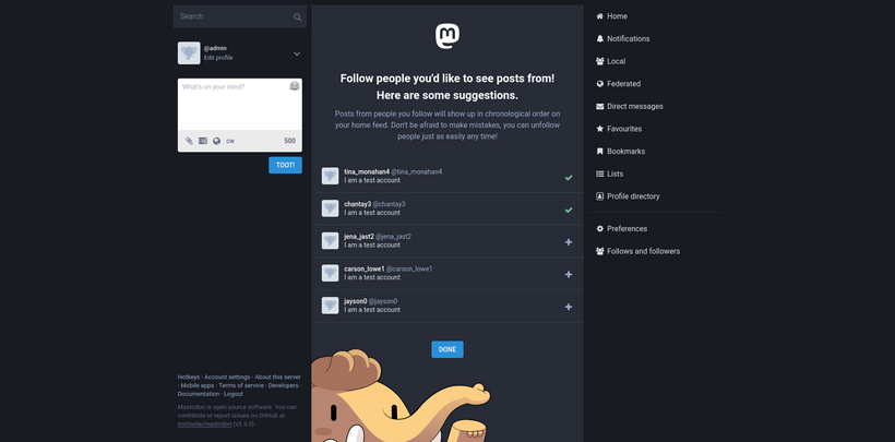
New users will now see this page on first launch of the web app. Obviously this is a screenshot from my development machine, so it’s just example data. Which brings me to: How did I decide to approach the interesting-ness problem.

In absence of other information to go on, I decided that the only reasonable approach is to use the wisdom of the crowd, or popularity. To minimize vectors for manipulation and ensure the presented content is actually fresh (no use recommending someone an account that’s been inactive for a long time, even if it has the most followers!), I chose to use only local data about accounts instead of relying on total follower numbers, and to consider only followers that themselves have been active in the past 30 days.

Looking at the results, I realized that “big name” accounts are not necessarily “interesting” accounts. Case in point the @Mastodon account itself: A lot of followers, but only updates when a new version of Mastodon comes out, that’s hardly something a person would stick around for. So I had to turn to content itself, by seeing who wrote posts that got the most engagements in the past 30 days. If everyone shares around the post, it’s gotta be worth seeing, right? In the end I went with a mix of both, most-followed and most-engaged-with accounts.

The one piece of information that we do have about new users is their preferred language. Not everyone on Mastodon speaks English, so I felt it was important to try and help people find content in their own language. I added some code that determines which language an account posted in most recently, and classified accounts into those languages, allowing the follow recommendations to be specific to each language. Since not all languages are equally active on Mastodon, the language-agnostic recommendations are used as fallback.

Now a bit of practical advice if you want your account to show up in those recommendations: Make sure that in your profile settings, you have opted-in to the “Suggest account to others” option (previously it was “List this account on the directory”). Your account will also not show up if your account is locked (“Require follow requests”). Since bios on Mastodon can get pretty wild and we’re working with limited space, the UI will display only one line of the bio and attempt to cut it to the first sentence only (to avoid mid-sentence cut-offs). So try to word your bio such that the first sentence describes you best.

Conversely, new users will no longer automatically follow admins. The admin setting that used to control this is still used though, now to push specific accounts to the top of recommendations (and it’s been renamed). There’s a new API endpoint (/api/v2/suggestions) that shows a bit more information about each account, specifically the source of the suggestion: “staff”, “past_interactions” or “global”. I’m in talks with another UX designer to run some user tests on this new flow.

1 Like

I have the feeling this is #mainstreaming thus likely the wrong way to do this.

Would suggest to use #hashtags for users on account creation, instances get #hashtags on their instance subjects and the is the post #hashtags - mash these together in a creative way, and you have a non #mainstreaming bootm up way of giving users a good expirence.

Popularity is a VERY BAD messier of worth in the #dotcons and likely for the #openweb as well.

1 Like

At least steps in the right direction.

Full ack.
Particularly agree that we should give a shit about popularity and care for the interests!

This is the way, redaktor will handle it, first, users are encouraged to

  • specify the languages, they speak in a weighted order
  • #hashtags everywhere

Lighter indicators can be the default selected timezone, the Profile summary etc.
Last not least, you can e.g. set the order of menu items for Object types and we also use this as an indicator. So, if you put Video on 1 you might (depending on the rest info) get different results than with Article but this is more a fallback.

This is ice squirrel and cream, how about toppings?

There is no need for “introduction, neuhier, Introducción” because we could specify a new type for it like
{"type": ["Note", "ext:Introduction"]} and everyone could deal more intelligently with the provided infos / hashtag.

What can “extend” hashtags would be Controlled Vocabularies and Topics.
They can give suggestions in the sense of the soul of your implementation (e.g. journalism, science) and Topics could be a “Relay Actor” with type Service so that we can follow them.

And we can start to build Relationship / Connections for the user which would also form an indicator for interest.

I agree that this solving of the “interesting-ness” issue may introduce problematic features in the way it is designed. Unless I misunderstood, it is literally pointing newcomers to ‘influencers’ they can follow, with:

  • Who wrote posts that got most engagement in last 30 days, combined with
  • Who got most followers

These metrics can (and probably will) be gamed by would-be influencers. It encourages lowest denominator communication that happens to attract most people (in similar ways as it does on traditional social media).

Assuming the “interesting-ness” problem exists in the same way it does on Twitter, i.e. “you must give a new user something interesting in the first few seconds on the app or they bounce”  (which is an open question), what are other ways this could have been solved?


Inform & educate

I always very much liked the appeal of Fediverse apps being fundamentally different than traditional social media. One of these aspects being that they do not ‘optimize for engagement’.

They don’t have algorithms pushing you to what happens to be popular. The content that the most vocal fedizens, spending most time online push out to the world.

There is a beauty in a personal timeline that stays empty, waiting patiently for you to explore some of the fediverse on your devices. Something you fill in gradually with things that interest you. These engagement features diminish that beauty.

What you might offer new users instead, is an onboarding tutorial (or even wizard) that is integrated with the UI. So when you go to your personal timeline you’d see text explaining why this window is empty, and in what way that is beautiful.

Teach the culture of the Fedizen, while you are at it.

‘Reversed engagement’

Why push content to a new fedizen? Wouldn’t it be better if people were able to pull based on their own interest to be on the Fediverse?

Let the onboarding experience encourage them to create a nice and complete profile here, with avatar, description, metadata fields, etc. and also with Hashtags that indicate their interest. They may choose from lists of popular hashtags when filling this in, or add their ones.

Then, with profile creation complete, broadcast that out to the Fediverse. Maybe using some special hashtags to do so. These introductions may be automated, after the newcomer consents to them. Toots are sent that include interest hashtags of the new fedizen and maybe a custom text. I think this is also the mechanism that @Sebastian is referring to.

Something that would be nice if the Microblogging app would integrate with other federated apps here. Maybe introductions are sent to Guppe groups, or to a #software:lemmy space, where interested fedizens can take note, and give follow-up.

The engagement is turned around now, where existing fedizens (people !) actively reach out and welcome newcomers, and social connections are forged based on discussions that arise from the introductions.

‘Timeline tasting’

This is more of a brainstorm-y idea, but it may be interesting to explore further…

The personal timeline of existing fedizens is public. In these timelines, by the use of hashtags and keywords in the text a fedizens interests and focus is expressed. These fedizens have already overcome the onboarding phase on their account. Clicking on their account opens the timeline in a new browser tab.

What if a newcomer could temporarily ‘impersonate’ the timeline of someone else, so its content shows up in their own timeline, and they can directly follow people from there?

In order to find a specific timeline, the applications shows a list of topics / hashtags and based on newcomers selection is taken through random carrousel of timelines that match that interest. When the user is done, chose some Followers, their own timeline shows up again, now filled with some good stuff.

Hashtags

The onboarding experience may take the newcomer along Trending Hashtags, show how they can be followed in additional timelines, and advise how you find people to Follow from them to build your personal timeline.


Update: I created a pointer to this discussion from the related Github issue in the Mastodon repo, so more people might join the fun here. Also I mentioned the inspiring decision by @dansup to remove engagement features rather than add them…

1 Like

I think this is also the mechanism that @Sebastian is referring to.

exactly this.

What I meant by “step in the right direction” was “at least they now proactively suggest people in onboarding as described somewhere in Improving Fediculture ∞”
To be honest, the way mastodon simply copies features from twitter makes me angry and there is nothing I can do against it.
Captain Obvious: Nice people often try to avoid being popular.

In fact, it (popularity) creates multiple problems.
They all come down to my sentence “making the loudest even louder instead of equaling voices”.

Think about commercial advertising, nowerdays called “influenters”.
When the Fediverse reached a critical mass but promotes popularity, it will get influentia …

Let’s ignore popularity and fight misinformation.
Please let us be “engagement”, “interests”, “truth”.

I always very much liked the appeal of Fediverse apps being fundamentally different than traditional social media .

was also one of two main points in my letter to Robert Riemann / Commission …

The other one was to show them the fragmentation:
“ Because they are ActivityPub conformant and implement C2S (!), the user can use any client with their server of trust. There is no fragmentation! ”

While when you say, you need a mastodon server to use (only) the mastodon client, the user has their data spread across different servers.

The vision of ActivityPub is so similar to indieweb’s micropub
In micropubs a user has their own server and uses any client with it. Why does micropub people understand? Can we too?


1 addendum to hamish:

Since bios on Mastodon can get pretty wild and we’re working with limited space the UI will display only one line of the bio and attempt to cut it to the first sentence only

This is what I would not do.
Please let us be careful with other peoples content an not censor anything by default and let us try to not loose content.
We are working with limited space but design can solve it.

I tried to show it in demos on FRI Social CG but showing anything in 5 minutes is ridiculous :frowning:
However :wink:

redaktor has components like

  • Collapsed
    like <Collapsed lines={3}>content</Collapsed> would collapse it to 3 lines and as noJS-fallback has html details

  • Paged
    is like a rotator with arrows (sequential content) and radio-hack as noJS-fallback

  • Popup
    can help on mobile, problem noJS fallback must come with extra <noscript>

l

Yes, I agree on most if not all of what you say. I was just thinking that we all (me too) best formulate in this thread in general terms, so that we focus more on functionality, rather than which app does things wrong or right (you may of course point to features you have available already). This to make this as productive as possible. I will edit my own post.